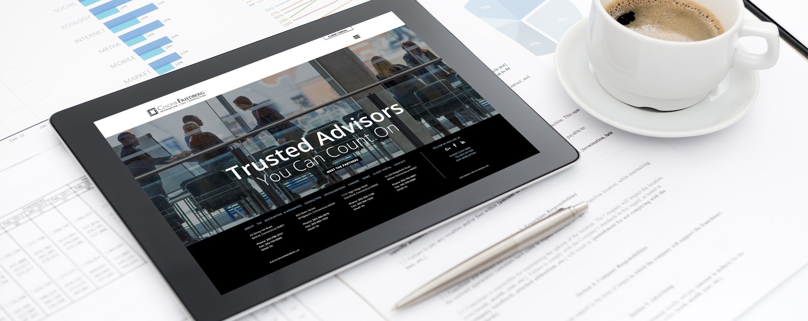
 Your website’s footer is as important as designing the header.
Your footer is at the bottom of your website and it will appear on every page, yet we’ve seen footers that clearly look like an afterthought. A great website designer knows designing a footer is equally important as the header and other elements throughout the homepage.
Why is your footer so important?
It’s the only section where you can mention important pages, special offers, social media, and subscription opt in all in one concise space.
Navigation: Visitors who can’t find what they’re looking for or are trying to find a specific page, for example ‘About us’ or ‘Customer service’, often have a look at the footer.
Provide information: Your visitors expect to find specific information in the footer, including your contact details and general terms & conditions.
Branding: Use your brand-style colors and (once again) include your logo and social-media buttons to boost visitors’ connection with your store.
The Anthropologie footer, is informational and leads the user to the important pages of the site, consistent branding, social media links and has a promotional statement for all to see.
 Due to the footer being displayed globally across the website, you want a mixture of search engine friendly content and user friendly content.
What Should Your Website Footer Contain?
Contact details – This column is probably the only one solely designed for the user rather than search engines. Other than the ‘Contact us’ page, the header and footer are the two main places where a user would look for contact details, whether it be an e-mail address, e-mail contact form, map or telephone/fax number.
Social Media – Almost all websites include social media buttons tucked away either in one of the top corners or at the bottom of the page. The advantage of putting it into a footer or sidebar is that it can easily be replicated and stays on each page at the same place, so that the user doesn’t need to go hunting for it. While most people put only buttons from Twitter, Facebook, Google+ and a couple of others, there is also growing popularity for some newer names. With the advent of plugins for social media buttons, it is even easier to integrate a whole set of buttons in a couple of clicks.
Newsletter Signup – This is possibly your last chance to make contact with your visitor before they leave, you want to make sure you have a way to contact them in the future. Offering a newsletter sign up is a great way to build your email list. Remember, very rarely does a consumer make a purchase on the first contact, it often takes 4-5 interactions before they decide to do business with you.
Keep it simple and organized.
There is obviously no ready-made answer to exactly what your footer should look like, but it should be representative of your brand and include the basics we mentioned above. It all boils down to what your website is about and what content goes on it.


